“Joker” (2019) Review
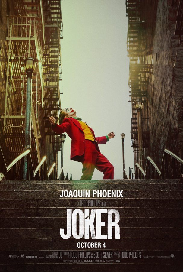
Spring has come, and even with rainy April showers there are clusters of vibrancy all around. Within 2019’s Joker directed by Todd Phillips, there is a unique use of color throughout the film. Gotham city has always been portrayed as a bleak, gray, and miserable city. While this is evident in Joker, it does differ from previous films in that the vintage coloring of the shots. From the TV show to the children’s hospital, every scene feels set back in time, yet the events and overall tone are modern day. Color played a crucial role in this film, particularly when conveying innocence and happiness being destroyed. The film follows a pattern with pockets of brightness surrounded by dark and muted colors. Joker is often the center of the color, with lively makeup and wardrobe. His brightness is often crushed by ghastly violence, heavy emotions, and lurking shadows that threaten to snuff out his candle completely. You feel the impending dread in every scene, but you also see Joker become brighter while Gotham darkens as the movie goes on. While he is the most twisted character in the film, he is a lighthouse on a pitch-black sea.
Color Rating: 8.5/10
Overall Rating: 6/10


